Sunday 13 May 2012
Friday 11 May 2012


Thursday 10 May 2012

Wednesday 9 May 2012
Evaluation Question 4
Monday 7 May 2012
Evaluation Question 3
What Have You Learned From Audience Feedback?
(Watch presentation in Full Screen by clicking the fullscreen option in the right hand corner )
Thursday 3 May 2012
Evaluation Question 2
Q2: How effective is the combination of your main product and ancillary texts?
Monday 30 April 2012
HK: Creating The Digipak
I created my digipak in the software Adobe photoshop, this was a goodsoftware to use as I could use different image and text effects.
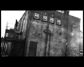
Firstly I used a shot that we had used in the music video, the shot of the the warehouse, i printscreened this fromthe video footage as a JPEG and imported it into photoshop after this I adjusted the levels of the colour to add a darker black and white effect to thephoto.
Firstly I used a shot that we had used in the music video, the shot of the the warehouse, i printscreened this fromthe video footage as a JPEG and imported it into photoshop after this I adjusted the levels of the colour to add a darker black and white effect to thephoto.
 I again took a printscreen from our video, this was a printscreen of anilluminati eye, i used multiple layering and a blending modes and changed theopacity to blend the eye to look like it was on the wall.
 I made a NIN logo, using shape tools and the text tool, then added a filtereffect. and put this in the black space at the bottom aswell as the Album name'Lights in the sky' and 'Nine Inch Nails'
I used a small gold font for the artistname, but most our of audience would recognise the NIN logo.
 For the rear of the digipak I used the same image as the front but zoomedin as this is common to have correlation between the front and rear panels.
All i needed to do was just adjust the size of the two images by freetransforming the image then dragging the corners until the size was
I added a black rectangle at the bottom of the page to include company logo's,copyright information, barcode, social media # and @ which I imported the facebook and twitter icons.
I used a white font to stand out for the background to include the set list ofthe album.
 I edited the inner panels again by using blend modes and adjust the lightinglevels of the image and zooming and cropping in to create a nice effect where the two images were linked but still different.
Saturday 28 April 2012
HK: Role of Audience Feedback
Audience feedback is of paramount importance and absolutlet vital when creating a product, gaining feedback is the best way to refine your product so that its fit to the audience. It gives an honest opinion of what works and what doesn't and this is incredibly helpful to get different perspectives on your products because sometimes when youre making the product you don't notice its flaws and what you need is for someone to just say No that isn't working.
 We have taken feedback from a wide range of people over the past few months which has led to doing more and more drafts until eventually we got our polished final pieces.
For example the video is so different to how we ever imagined and this is through changing it to fit the audiences comments like when they didn't understand what was going on in the video, we made the narrative easier to follow.
There were many different ways we gathered feedback, one being showcasing our work to a class full of media students who were also making a music video so knew the codes and conventions and were able to offer us a very critical response to our products. This was perhaps the best way to get feedback because we managed to get alot of valid feedback in a short space of time as the footage was showed to the whole class.
We got feedback from our teacher who offered a very critical and proffesional approach and had the media knowledge to determine what was working and what wasn't.
It was also good to get feedback from people who didn't know much about media and offered a basic review of the products and what they didn't like or did like.
We used social sites like Facebook and Twitter to gather feedback online from Nine Inch Nails fans and also we posted our work on a Nine Inch Nails fan site forum. This was great because we got good feedback from people who were in our target audience.
We have taken feedback from a wide range of people over the past few months which has led to doing more and more drafts until eventually we got our polished final pieces.For example the video is so different to how we ever imagined and this is through changing it to fit the audiences comments like when they didn't understand what was going on in the video, we made the narrative easier to follow.
There were many different ways we gathered feedback, one being showcasing our work to a class full of media students who were also making a music video so knew the codes and conventions and were able to offer us a very critical response to our products. This was perhaps the best way to get feedback because we managed to get alot of valid feedback in a short space of time as the footage was showed to the whole class.
We got feedback from our teacher who offered a very critical and proffesional approach and had the media knowledge to determine what was working and what wasn't.
It was also good to get feedback from people who didn't know much about media and offered a basic review of the products and what they didn't like or did like.
We used social sites like Facebook and Twitter to gather feedback online from Nine Inch Nails fans and also we posted our work on a Nine Inch Nails fan site forum. This was great because we got good feedback from people who were in our target audience.
Sunday 1 April 2012
Evaluation Question 1
In what way does your media product use, develop or challenge form and conventions of real media products?
Thursday 15 March 2012
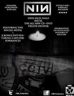
HK: Digipak Feedback
Like for both the video and Magazine advert the Digipak also required alot of different drafts until it was finished.
Feedback gained on the digipak suggested that the design was good but it was some of the small details that let it down, things like not being able to read the track list on the back.
Feedback:
Front Panel
- Add sticker to the front promoting Bonus DVD
- Change the font of the album name
- Change the text on the rear so that all tracks can be clearly seen
- Add copyright info instead of just NIN web adress
- Replace QR code with bar code.
- Add serial number to the spine
- Add more detailed copyright info
- Add track lengths
- Add information on Bonus DVD
Tuesday 21 February 2012
BH: NiN & relationship to the Industrial Genre

For example Pretty Hate Machine (1989) was much more of a synth pop album with elements of Industrial mixed in- although he admits to 'Down in it" being heavily inspired by Skinny Puppy- Dig It. Skinny Puppy being a Canadian Industrial group noted for their abstract and shocking music. Pretty Hate Machine being closer to Cabaret Voltaire's style of Industrial, much more computer generated beats and loops, using samples but not straying too much into Rock.
The Industrial influences of Ministry come across far more in the next release 'Broken', which was an overall much heavier album which clearly draws on from ministry's heavier vision of the industrial genre, with songs such as 'Happiness In Slavery' and 'Wish'. The next Release, 1994's, The Downward Spiral draws into the industrial genre heavily, the computer generated music fused with the instruments it's far more of a 'typical' Industrial record dealing with the traditional Industrial themes of the break down of society and what that'd cause0 a theme strong throughout every song on the album. This is where many say that Nine Inch Nails really came into the genre and it inspired much of the Industrial music available now.
The Fragile was in many ways much more of an album that's in many ways quieter than prior releases, also much longer and in almost a contrast with the Downward spiral, its a much more personal based album.
With_teeth is a much more mainstream Rock album, its very punchy in line with a more modern approach to industrial music and the industrial design. It's interesting to note that around this time Skinny Puppy launched back into action.
Year Zero is where the real politics of NiN comes out, highly critical of the Bush administration of America (as many musicians where). It details a near future society where the American government was too powerful and merged with the church- it accompanied a ARG (alternate reality game).
BH- Location, Location
To put it simply Bradford is the perfect location for the music video- not only as a former industrial town itself (not in that sense!) but as a town with a clash of different and opposing idea's- the old Victorian style which clashes with the more modern aspects of the town in a whole host of different locations. Then there's the Bolton Wood quarry, where the final 'section' of the music video takes place. And various sections are filmed very close to it.

So here is a shot of the quarry from an angle similar to our closing shots of the main narrative, obviously very high up with a near panoramic view of Bradford, ideal for a closing location, with this it's a case of how we fit everything we want into the frame rather than what we don't want in the frame.
 The location once again from a different angle, as you can see it lends itself to the look desolation and isolation, it looks quite far from locations nearby and generally a wide open space, now for obvious health and safety issues we can't film IN the quarry- which makes the ending problematic somewhat, as the final shots of the main narrative is a shot of the protagonist lying on the floor on the quarry, but luckily we can substitute here as the shot will be a close up/ extreme close up it makes it extremely easy to find an ideal location.
So here is a shot of the quarry from an angle similar to our closing shots of the main narrative, obviously very high up with a near panoramic view of Bradford, ideal for a closing location, with this it's a case of how we fit everything we want into the frame rather than what we don't want in the frame.
BH: Updates!
 So with the snow thwarting yet another film shoot, this has meant that we now have to film all the footage we need on Sunday 12th February 2012. This means that we have a need to move fast to edit the footage, which means that we hope to have a new rough cut before 18th Feb so that we can do any urgent re-shoots in the following few days.
We're making strides with the mag ad however which gives us more time to spend on the digipak- which also hangs on using images from the performance aspect of the video.
Friday 17 February 2012
BH- Casting continued
 So the feedback we recived for our sample footage clearly indicated that there was an issue with using a young looking protagonist- it didn't fit in with the genre was one of the main issues raised. Obviously we're trying to cater to two different audiences with our video.
A) Re-brand the NiN band to better fit with a modern audience (youth 15-24)
B) Appealing to the older NiN audience- the established fan-base
who have been listening to NiN since the late 80's.
So to do this we thought that our casting had to be reviewed carefully- how we could get our casting to better reflect the video theme.
Checking through we've decided to cast my Uncle in the role....
He's older and thus would appear better in the video- but not so old as to alienate the younger audiences.
He suits the role too with Black hair and stubble- thus making him near perfect for the video.
Friday 10 February 2012
BH: Updates
So with the snow thwarting yet another film shoot, this has meant that we now have to film all the footage we need on Sunday 12th February 2012. This means that we have a need to move fast to edit the footage, which means that we hope to have a new rough cut before 18th Feb so that we can do any urgent re-shoots in the following few days.
We're making strides with the mag ad however which gives us more time to spend on the digipak- which also hangs on using images from the performance aspect of the video.
We're making strides with the mag ad however which gives us more time to spend on the digipak- which also hangs on using images from the performance aspect of the video.
Tuesday 7 February 2012
KM:Feedback from Mag AD 2nd Draft
Here are some of the main feedback points I received from the 2nd draft of the Magazine Advert:
- The social network (Facebook and twitter) icons need to be downsized
- Add itunes info
- Make all the images better blended together ( no block images)
- Add tour dates
- Kerrang and Q logos
- Change some of the text sizes
- Include "Best of Nine Inch Nails"
HK: Things I Plan to Include in our Digipak
- NIN Logo on the front cover
- Add 'The Best of'
- Correlation between back and front images
- Create a booklet for the inner
- Scannable Bar Code
- Edited photos for the inner panels
- Copyright Information
- Logo's
- Track List
Monday 6 February 2012
HK BH: Feedback - MagAd and Sample Footage 2
Mag Ad:
Sample Footage(two):
So now we've got a second rough cut done, with some of our new footage including our new character and locations we wanted to gain some feedback on this so we showed it to everyone in class and also posted the clip on an official Nine Inch Nails forum. We were lucky enough to get feedback from a forum administrator who fit into our secondary audience a 25 - 34 year old existing Nine Inch Nails fan. This was great to get feedback by someone who really new the genre and especially Nine Inch Nails.

- The Mag Ad feedback received was that it was overall very good. However elements such as the font used seemed unusual and not as varied as it could be.
- Replace the URL's with just icons- they're generally familiar with everyone.
- Good enigma / lack of exposition- it looks obscure and in keeping with the Nine Inch Nails 'tone'.
- The beware CCTV looks good and fits.
- Framing of the candle seems to be good- fits with theme of the genre
- Some of the blending between images (the solid lines between them)
So now we've got a second rough cut done, with some of our new footage including our new character and locations we wanted to gain some feedback on this so we showed it to everyone in class and also posted the clip on an official Nine Inch Nails forum. We were lucky enough to get feedback from a forum administrator who fit into our secondary audience a 25 - 34 year old existing Nine Inch Nails fan. This was great to get feedback by someone who really new the genre and especially Nine Inch Nails.
- The special effects worked
- pace was good
- good variation of shots
- Some shots are on screen too long & are too jarring/ don't mesh well with the editing style.
- Maybe even more enigma!
- More could be done with the fire extinguisher (loop to beat?)
- Shots of just the protagonists eyes would still maintain the enigma, or extreme close-ups.
- Frames slipping would add to the damaged video effect.

BH: Editing Process Sample 2
 |
| example of editing |
The editing was more fast paced than before which meant that we had to cut 10 mins of solid footage into around 34 seconds. The pace was very fast which meant that we had some issues with the amount of footage recorded but obviously with more footage we can afford to do some longer takes. The screen of final cut (left) is a neat example of how we created the video footage effect, combined with total desaturation. Also notice the frame around the footage which we dragged out to tighten the framing on some shots where the framing would detract form the image. Overall to get the 34 seconds- the editing must have taken around 7 hours overall to generate the desired effect. Of course to create the sample footage we exaggerated the special effects somewhat so that the more FX side of the video is on display, in the final video we expect the effects to come in somewhat more gradually rather
KM: Magazine Advert Draft 2
Here is our 2nd magazine advert draft: (click here for full size image)
 I made a couple of changes after receiving feedback from the rest of the media group; I first swapped the full URLs of the social networking sites with icons, as this looks better and most people are familiar with these icons. I 'onion skinned' the icons on Adobe flash, and changed the colours before adding them to the ad. I then used the 'layer mask' and 'gradient tool' on Photoshop to try to better blend the pictures together, in particular the "Beware of the CCTV" image, as we received feedback that the edges of this image were too defined. A problem I came across when doing this was the fact that when trying to blend the middle of the image to the background, the CCTV sign became harder to make out, so I focused on the sides of the image, so that you can still read the sign, but the edges aren't as noticeable. I also tried changing the fonts, but after trying various different ideas, I changed them back to my original fonts of; 'charlemagne standard' for the writing at the top of the ad, and 'myriad pro' for the social networking
 I made a couple of changes after receiving feedback from the rest of the media group; I first swapped the full URLs of the social networking sites with icons, as this looks better and most people are familiar with these icons. I 'onion skinned' the icons on Adobe flash, and changed the colours before adding them to the ad. I then used the 'layer mask' and 'gradient tool' on Photoshop to try to better blend the pictures together, in particular the "Beware of the CCTV" image, as we received feedback that the edges of this image were too defined. A problem I came across when doing this was the fact that when trying to blend the middle of the image to the background, the CCTV sign became harder to make out, so I focused on the sides of the image, so that you can still read the sign, but the edges aren't as noticeable. I also tried changing the fonts, but after trying various different ideas, I changed them back to my original fonts of; 'charlemagne standard' for the writing at the top of the ad, and 'myriad pro' for the social networking
KM - Magazine Advert Draft
Here is our first draft of the magazine advert, after discussing it through as a group, I will then make any changes that we feel are needed. (Click the image for full size)

Sunday 5 February 2012
KM - Creating The Magazine Advert (Background)
The first thing I did when starting on the magazine advert was to get a good background of blended images to put the information about the digipak etc. over the top of. For the images I used screenshots from our original sample footage, here are links to the 5 images I used:
Image 1
Image 2
Image 3
Image 4
Image 5
I used the image of the Graffiti cat and the image of the CCTV sign as the base for the background after first changing the background colour to black.
After inserting the first 2 images into Photo shop I added a 'layer mask' to the image of the cat and then used the gradient tool to blend the 2 images together (after overlapping the images where I wanted them on the advert). I also used the gradient tool to blacken the edges of the advert, so that the writing that I was planning to put at the bottom (URLs) would stand out sufficiently.
After I had the first 2 images looking how I wanted I then added the next two (the puddle and the corridor) in parallel above them and again used the layer mask and gradient tool to blend them on top of the other images. I then did the same with the candle image, placing it in between but slightly above the top two images of the puddle and the corridor.
Image 1
Image 2
Image 3
Image 4
Image 5
 |
| The first 2 images before blending |
After inserting the first 2 images into Photo shop I added a 'layer mask' to the image of the cat and then used the gradient tool to blend the 2 images together (after overlapping the images where I wanted them on the advert). I also used the gradient tool to blacken the edges of the advert, so that the writing that I was planning to put at the bottom (URLs) would stand out sufficiently.
After I had the first 2 images looking how I wanted I then added the next two (the puddle and the corridor) in parallel above them and again used the layer mask and gradient tool to blend them on top of the other images. I then did the same with the candle image, placing it in between but slightly above the top two images of the puddle and the corridor.
 |
| Finished background |
 |
| Blending the first 2 images |
Thursday 2 February 2012
HK: Digipak Inner Draft 1
 I have started work on creating the inner panels for the Digipak.
The software I used was Adobe Photoshop Elements 6.0
- I found a photo of a keyboard online and inserted this image into Photoshop
- Then I did the same with an image of CCTV Camera's
- I then experiemented with blending modes and opacity to create a layered photo effect which looked like this ( below )


- After this i found an image of trent reznor the lead man of NIN and used Pin Light blending mode to create a nice layered effect.

Wednesday 1 February 2012

Tuesday 31 January 2012
KM - 30 Seconds To Mars Magazine Ad (Kerrang!)
Things included:

I plan on using a lot of the features of this digipak in our group's Nine Inch Nails digipak, such as; the band logo, the record company logo and details such as what singles are included and the bonus DVD. Something that doesn't feature in this magazine advert, but does often appear in others (and something we plan on including) is a number of tour dates on the advert
- Band Logo in the background of the advert
- Mentions of the singles/ other artists featured (Kanye West)
- Artwork of the album title/ band name
- Fairly plain white background
- Red coloured text
- Simple Serif font
- Record company logo
- "OUT NOW" in large writing
- Mention of the bonus DVD/ features
I plan on using a lot of the features of this digipak in our group's Nine Inch Nails digipak, such as; the band logo, the record company logo and details such as what singles are included and the bonus DVD. Something that doesn't feature in this magazine advert, but does often appear in others (and something we plan on including) is a number of tour dates on the advert
KM - Green Day magazine advert (Kerrang!)

Things that are included in this magazine advert:
- Screenshot from the video for the single
- Information about the album and single
- Release dates
- Image of album cover
- Use of red and white font
- Band name in large white font
- Information about the included DVD
- Record company logo
- Official website information
This magazine advert is split in two, with the main focus of the top half being an image from the performance section of the video for "Wake Me Up When September Ends", and the band/ song name. The bottom half of the ad features all the information about what is included with the album/single. It's structured in this way so that the viewers attention is caught by the large image and this encourages them to read the details in the bottom half of the advert.
Monday 30 January 2012
HK: Rythmns Del Mundo Digipak

The cover image is very eye catching anf stands out against the textured cream background.
The colours and the brightness of the cover image really reflect the type of music and culture this digipak would be linked to.
The digipak doesnt have any stickers on the front but does have a list of what artists it does feature which does the same thing, advertising whats inside.
The inner has a background of a cuban building then on top of this is another layer, this layered effect could be created on the software Adobe Photoshop which we have at school.
There is a sign/banner saying 'Rythms Del Mundo'
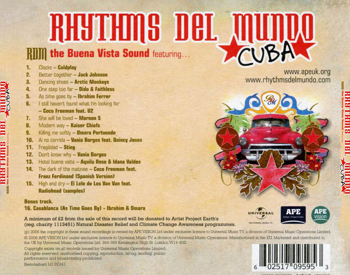 At the bottom of the inner panel is a quote about climate change in a purple font.
The back has the albumn name written across the top largely.
Underneath this is who it's by and there is a a track list going numerically down from 1- 15 saying both the track and the artist as this is a compilation CD/
The graphic thats seen on the front is again showed on the back.
Below this is 3 logo's, one of the record label and two of the charity of which money is being donated too.
There is information on how some of the money raised from the CD will go to charity in a small black font.
Below this at the very bottom of the Digipak is copyright information on the CD.
In the bottom right of the back cover is a scannable bar code.
HK: Linkin Park Digipak
 This is the Digipak for the album Reanimation by Linkin Park.
For this digipak they have gone for a cartoon/ animated graphic for there front cover.
The cover has an animated drawing of a robot or transformer type character.
The band logo is written in a large orange font in brackets along the top of the cover.
There is also the album name written in the bottom left corner in a bold black and orange font.

All photos have similar background just that the actual transformer changes.
The Back
The text on the back of the digipak is quite confusing, it is set out like the standard list of tracks but the text is quite obscure in orange and white fonts.
There is a red banner along the bottom of the digipak, this has a scannable bar code, copyright information and logos of the production company.

Friday 27 January 2012
HK: Codes and Conventions of Digipaks
After looking at a range of different digipaks it was clear that there were codes and conventions that were similar throughout each digipak.
- Album and Artist Name - Every digipak I looked at had the name of the album and who it was by on the front cover of the album.
- There is always either a picture or a textured background as the front cover.
- The inner panels often include a photograph of some sort and the images of the panels are usually similar, if not the same image but just edited differently.
- The image on the back is usually linked to the image on the front.
- There is always a bar code on the digipak.
Subscribe to:
Posts (Atom)